Use Interactive Analytics
Use the Interactive Analytics feature to create and view data sets using real-time information in your Aspen system. These data sets let you quickly gather and review multiple categories of information at the same time, helping you identify and assess situations that require prompt attention or future planning.
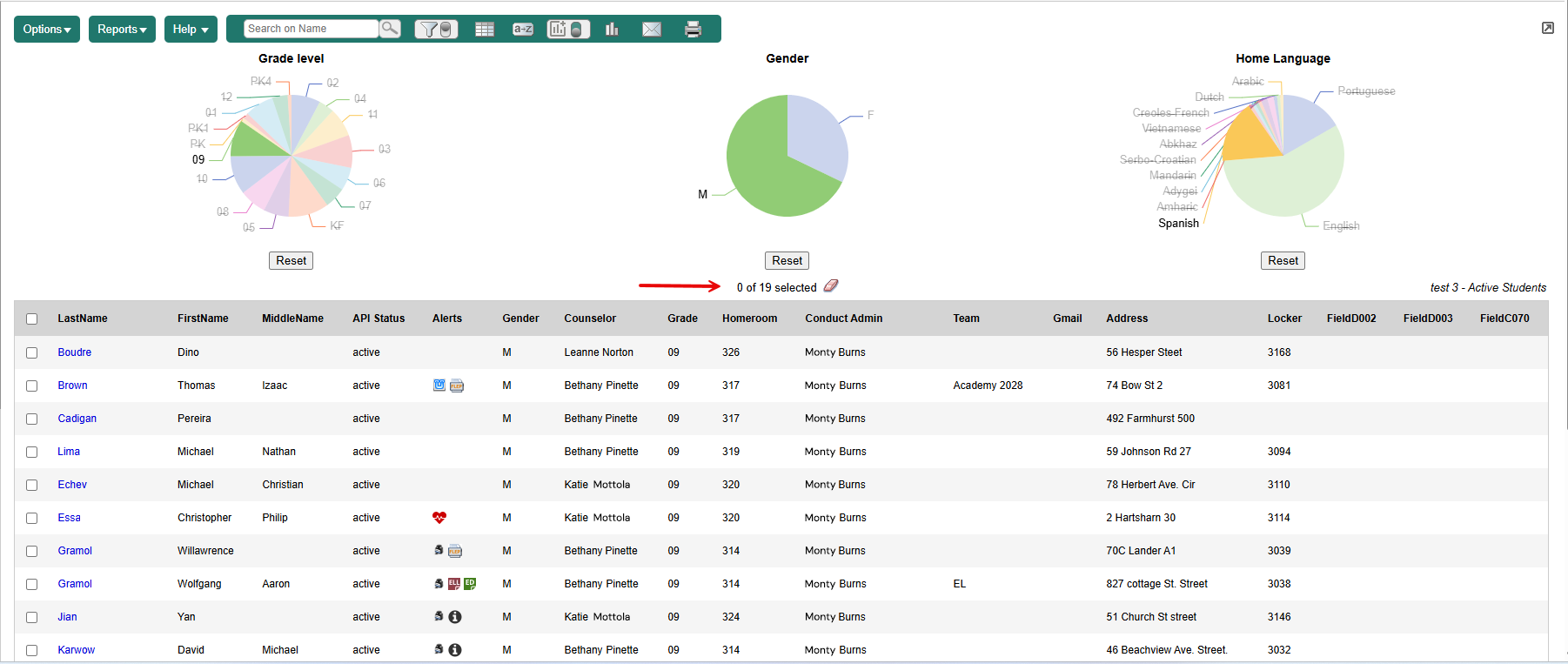
You can create an Interactive Analytics data set with up to three sets of data. Display them all in the same chart type (such as three pie charts) or use a mix of chart types.
| Note: The Analytics Chart colors preference lets users choose a colorblind-safe color palette for viewing Interactive Analytic charts. |
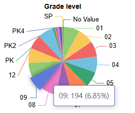
Click here to see an example.
To create an Interactive Analytics data set:
-
Log on to the District (Root Organization), Intermediate Organization, School, Staff, Build, Health, Special Education, or Personnel view.
-
Click the tab for the information you want to view. For example, if you want student information, click Student.
-
Click the Interactive Analytics menu icon
 .
.
-
From the drop-down, select Manage Interactive Analytics. The Manage Interactive Analytics pop-up appears.
-
Click +New. A pop-up appears:
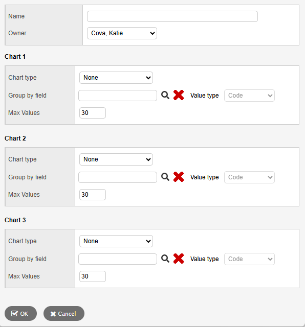
- Type a Name for this Interactive Analytics data set.
-
Click the Owner drop-down to select who will have access to it.
-
At Chart type, make a selection.
Note: Your data set can include up to three charts. They can be all the same type (such as three pie charts), or any combination of chart types. -
At Group by field, click
 . A pop-up appears.
 -
Select an Available Field from the list, and then click OK.
-
Click the Value type drop-down to select how the data is represented, such as by Code or Description.
-
At Max Values, enter an integer that represents the maximum number of data groups in the chart.
-
Repeat steps 8-11 for Chart 2 and Chart 3 (if desired).
-
Click OK.
-
Click Save.
-
To view your new data set, click the Interactive Analytics menu icon and select it from the drop-down.
|
Notes:
|
 for data sets to appear on the page.